Pop-Up Cards

307339_10200153374590511_616247676_n

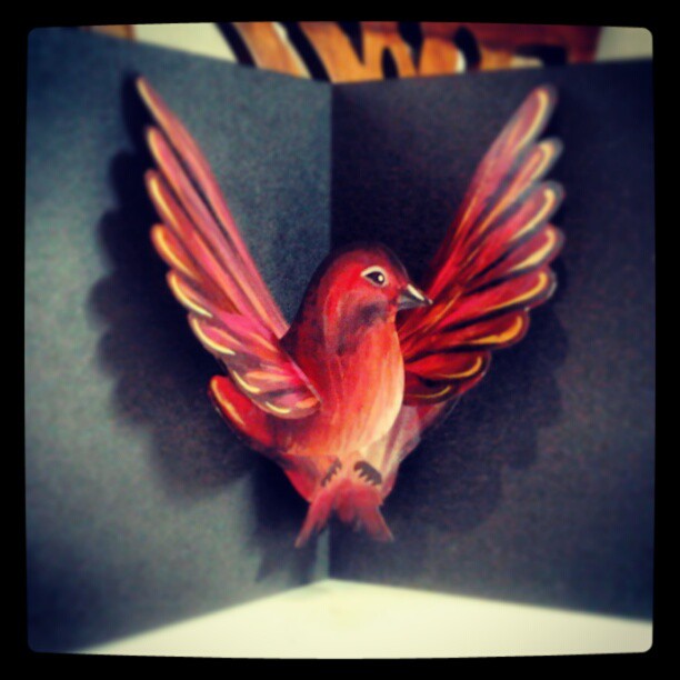
This Pop-up birdie was very fun to make! I found a template online for a standard pop-up bird and adapted it to fit my own purposes. This included looking at a lot of children’s pop-up books along the way which I enjoyed a bit too much. Each piece was painted separately with acrylics and then it was assembled.

At the moment the card is a simple square piece folded in half, however with more time I would like to experiment with different shapes and clolours.

Su Blackwell

The Baron in the Trees

This is just an example of Su Blackwell’s work. She works with books and paper crafting, creating beautiful and often melancholy scenes based on fairy tales and legends. The example above shows the amount of intricate detail that Blackwell puts into every image. She uses thin wire and cardboard to help the pieces stand up, apart from that everything is made from paper. The delicacy and fragility of the paper appeals to Blackwell as she feels that the stories she tries to depict are often surreal and with a dream like quality shown best with a fragile material.

The use of lighting and arrangement is also carefully considered. Sometimes the orange glow of a bulb will add a warmth to the scene and throw interesting shadows.

I highly recommend anyone to look at her website at http://www.sublackwell.co.uk/

x

Paint and Pen

Image

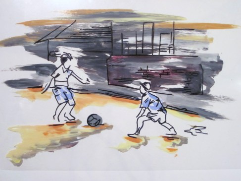
This week we have been looking at illustration. The image above is done with pen and acrylic paint onto acetate. What I like about this style is how you can put the image onto multiple backgrounds and get different versions of the same picture. For example, this would work well with a plain colour in the background as the image is quite detailed, but there is nothing to stop you from overlaying different pictures to give a busier outcome with more depth. I will keep experimenting! I hope you like it 🙂

Illustration Workshop

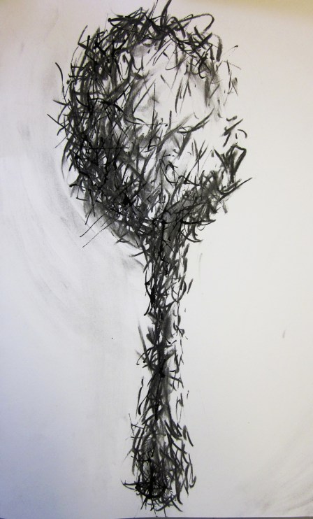
This was done with charcoal and Indian ink onto cartridge paper. We had an illustration workshop/taster session the other day in which the “painful spoon” was one of my projects. We were given an object and a word, as you can probably guess mine were a spoon and the word “pain”. I played around with a few ideas and this was one of the them 🙂

I didn’t use any colour as I found that I wanted to focus mostly on texture and mark-making for this piece. The charcoal effect gives it tone and depth as it isn’t as sharp and defined as the ink lines. It was quite difficult trying to show the smooth shape of the spoon but at the same time getting across the word “Pain”, by smudging in some of the charcoal its almost possible to see the original spoon underneath the spiky exterior. I hope you like it 🙂

Anne Bachelier

I found this French artist and Illustrator whilst doing some research for another project. I had never heard of her before but her work is well known especially in France. The piece above is just one of the many beautiful examples I found. Her subject matter is often transformation and metamorphosis which is illustrated in a slightly surrealist style. The use of colour and light, particularly in the background, shows the mood of the piece to great effect. I also love the way the hair is painted- it looks almost soft to touch.

I will definitely be looking into her work more! Some really beautiful images 🙂

3D Design


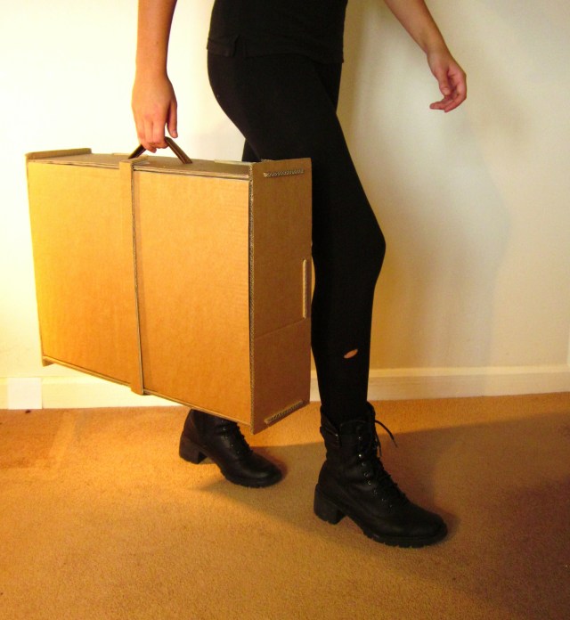
This was a really interesting project that we were given last week. The brief was to “Design and prototype an object that utilises the space within a suitcase and performs a function inside or outside the case”. I thought this was really up my street as I had done 3D Design at A Level! Unfortunately I was ill for half the week so there wasn’t as much opportunity for design development, though I definitely worked as hard as I could on Thursday and Friday to get my idea completed!

Essentially it is a suitcase that folds out into a table, but there is still storage space in the centre.
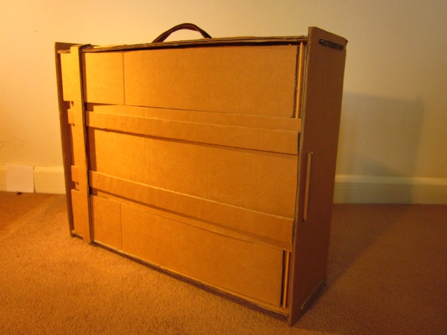
In this photo you can see the legs folded down into the suitcase. The strap holds them in place when the case is being carried.
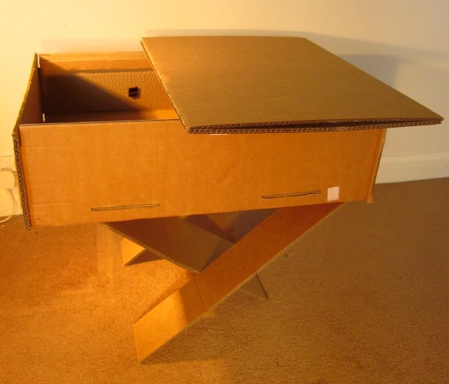
Here you can see the legs unfolded with the table top taken out of the case. The top actually folds out again to twice that size and it fits over the top of the case. The storage inside can be accessed quite easily just by folding the table top in half 🙂

The most difficult thing about this project was the amount of calculation that went into making each piece. Every bit had to be accurate or it wouldn’t have fitted together and it definitely would not have held together when being carried!

Another slight problem is now I don’t have a clue where to keep it!

x
Fashion and Textiles

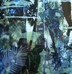
Collage for my fashion project, with figures on acetate in the foreground.

This is an image of a collage I made for my fashion and textiles project last week. We were told to imagine what the  world could be like thousands of years in the future, this was my interpretation! Its a mixture of photographs and cut out tracing paper. The figures were drawn onto acetate and then painted with different textures and patterns that were inspired by natural textures. The main theme was camouflage as you can see!

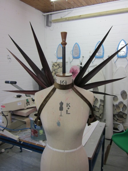
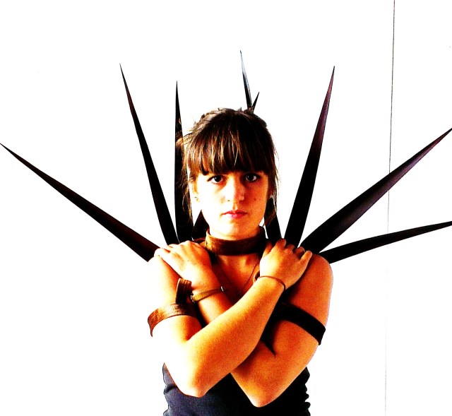
This is an image of my piece in progress! The brief was to create a body adornment that would be useful in the future world we had created. After researching into camouflaging techniques used by animals as well as the military, I came across the idea of distorting the silhouette of a person so they aren’t so easily detected by predators.

Essentially it is a series of straps that different shapes can be attached to. It may not be the most practical body adornment but it definitely changes the changes the shape of your silhouette! The final piece is modeled below.

x

Sara Fanelli

A book spread from “Pinocchio” 2003

Whilst researching some illustrators and graphic designers for my visual communications project I came across Sara Fanelli. She is quite a well known illustrator and I have fallen in love with her work!

The piece above is a book spread from “Pinocchio” which she was commissioned to do in 2003. The longer you look at this piece the more detail you see. The background shows a 19th century pastoral scene that looks as if it is from some sort of engraving. Its a good example of how Fanelli uses a lot of collage in her work. I think it is very effective as it adds more tone and depth, whereas her characters are quite flat in contrast to the background. I love the way the characters are portrayed- the fox seems almost sly in the way he is positioned and the shape of his face, he seems to be leading the cat along.

Compared to other work by Fanelli, the colours are quite muted. Often she uses a lot of bright colours to show the mood and atmosphere of what she is illustrating. I hope you like her work as much as I do, definitely worth a look in!

x